Landing Page UX Patterns That Increase Leads
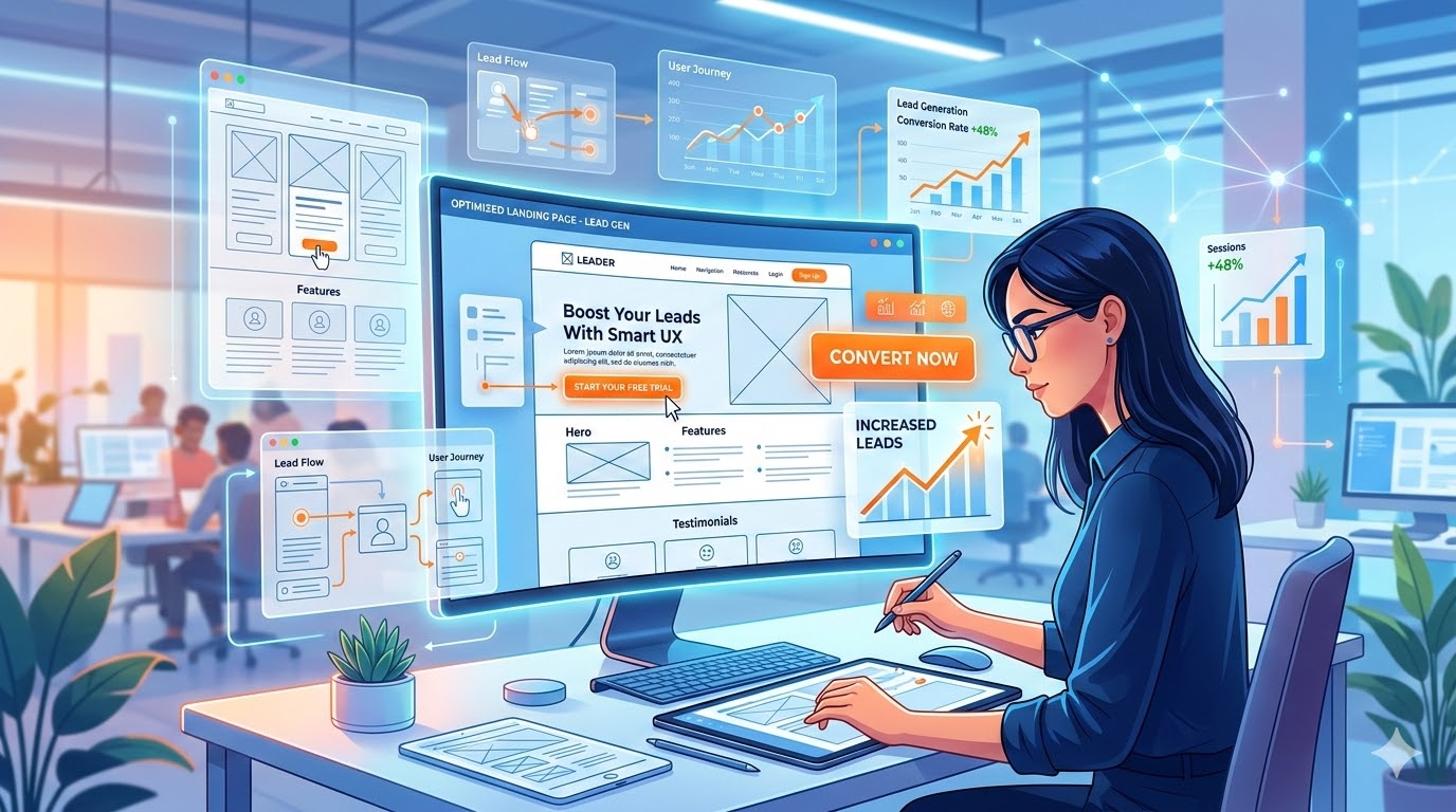
Landing pages are the backbone of online conversion. Whether you’re running an e-commerce store, SaaS product, or lead generation campaign, a well-designed landing page can drastically improve your conversion rate. In this post, we’ll explore proven UI/UX patterns that increase leads, with actionable tips and examples.
Layout Hierarchy – Lead the Visitor’s Eye
The human eye naturally scans pages in patterns like F-shape or Z-shape. Proper layout hierarchy ensures your visitors see the most important information first:
- vermittelt die Botschaft klar und schnell
- reduziert unnötige Ablenkungen
- baut Vertrauen auf
- führt den Nutzer gezielt zum Call-to-Action
Example: Dropbox’s landing page uses clear headlines, visuals, and CTA placement to guide users seamlessly.
CTA Placement – Make It Impossible to Miss
The Call-to-Action is the goal of your landing page. Placement, color, and wording are critical:
- einer starken Hauptüberschrift, die sofort Aufmerksamkeit erzeugt
- einer Subheadline, die den Nutzen erklärt
- unterstützenden Visuals oder Illustrationen
- klar platzierten Call-to-Action-Elementen
Tip: Test CTA positions with A/B testing to find the highest-performing layout.
Proof Blocks – Build Instant Credibility
Users hesitate before converting. Proof blocks give them confidence:
- CTA oberhalb des sichtbaren Bereichs (above the fold)
- Wiederholung des CTA an wichtigen Punkten der Seite
- Verwendung klarer, aktionsorientierter Texte
- Kontrastreiche Farben, damit der Button sofort auffällt
Example: HubSpot uses customer logos and stats to establish trust instantly.
Friction Removal – Make Conversion Effortless
Every obstacle reduces conversions. Reduce friction by:
- Ist dieses Unternehmen seriös?
- Haben andere Kunden gute Erfahrungen gemacht?
- Kann ich diesem Anbieter vertrauen?
Insight: Even a single extra field in a form can drop conversion by up to 11%.
Mobile-First Design – Capture the Majority of Users
More than 55% of web traffic comes from mobile. Ensure your landing page:
- zu lange Formulare
- unklare Informationen
- zu viele Optionen oder Ablenkungen
- komplizierte Navigation
Tip: Test pages on multiple devices and screen sizes.
Extra UX Tips That Boost Leads
- schnell laden
- gut lesbare Schriftgrößen verwenden
- große, leicht klickbare Buttons besitzen
- klare und kompakte Inhalte anzeigen
Conclusion
A landing page is more than a page—it’s a conversion machine. By combining layout hierarchy, clear CTAs, proof blocks, friction removal, and mobile-first design, you create an experience that encourages action and maximizes leads.
Ready to turn your landing page into a powerful lead-generation machine? Our team at Apexiom helps businesses design high-converting websites with proven UX strategies.
More posts
 Websites & Conversion
The 5-Second Rule: What Your Website Must Communicate Immediately
March 25, 2026 Websites & Conversion
Why Most Business Websites Fail to Convert – And How to Turn Yours Into a Revenue Engine
February 14, 2026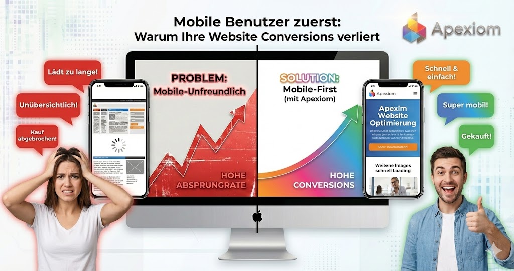 Websites & Conversion
Mobile Users First: Why Your Website Loses Conversions on Mobile?
February 4, 2026
Let’s build your digital future together
From the first idea to measurable success, Apexiom Engineering is your partner for software, AI and sustainable growth. Made in Germany, personal and on equal footing.