The 5-Second Rule: What Your Website Must Communicate Immediately
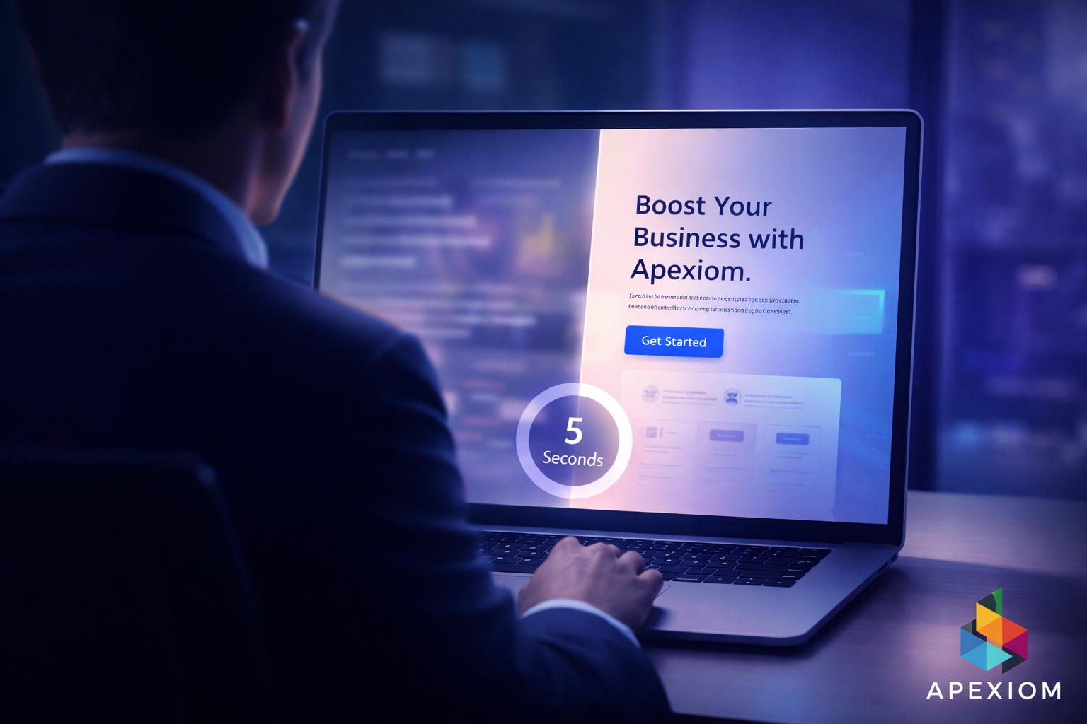
A visitor lands on your website. They don’t read everything. They don’t scroll immediately. They scan. And within 5 seconds, they decide: “Is this relevant for me — or not?” That moment determines everything. Not your design. Not your features. Not your long explanations. Just those first seconds.
What Happens in Those 5 Seconds
Your visitor is subconsciously asking:
- What do you offer?
- Is this for me?
- Can I trust this?
- What should I do next?
If your website doesn’t answer these questions instantly, the visitor leaves. No second chance. No conversion.
The Above-the-Fold Reality
“Above the fold” is the first screen a user sees — without scrolling. This section is not just important. It is the most valuable real estate on your entire website. Yet most websites waste it with:
- vague headlines
- generic stock images
- unclear messages
- no clear next step
That’s where conversions are lost.
The 5-Second Website Checklist
If your homepage doesn’t communicate these five elements instantly, it’s underperforming.
1️⃣ Clear Outcome (Not Just a Service)
Visitors don’t care about what you do. They care about what they get. Not: “We build modern websites” But: “Get more qualified leads through your website.” Clarity beats creativity — every time.
2️⃣ Who It’s For
Make it obvious who your offer is designed for. Examples:
- “For local businesses”
- “For SaaS companies”
- “For service providers”
When people feel addressed, they stay longer.
3️⃣ Trust Signals
Before taking action, visitors look for proof. This can be:
- client logos
- testimonials
- results
- certifications
Even small trust elements can dramatically increase engagement.
4️⃣ Visual Direction
Your design should guide attention — not distract. A strong above-the-fold section:
- focuses on one message
- uses clean layout
- highlights the most important action
Confusion kills conversions.
5️⃣ A Clear Next Step
Never leave the visitor guessing. Tell them exactly what to do:
- “Book a free consultation”
- “Get your audit”
- “Start now”
The easier the next step, the higher the conversion rate.
A Quick Reality Check
Open your website. Look at it for 5 seconds. Then ask yourself:
- Is the message instantly clear?
- Do I know what this company does?
- Do I feel confident enough to continue?
If not, your visitors feel the same.
Why Most Websites Fail Here
Many businesses focus on:
- design details
- animations
- features
But they forget the most important thing: Communication. A beautiful website that doesn’t communicate clearly will always underperform compared to a simple website with a strong message.
🚀 Turn Your Website Into a Conversion Machine
At Apexiom, we design websites with one goal: results. We don’t just focus on visuals — we structure your website to communicate the right message within seconds and guide visitors toward action. From positioning and messaging to high-converting layouts and funnels, we help businesses turn their websites into reliable lead-generation systems. 👉 If your website looks good but doesn’t generate enough inquiries, Apexiom can help you fix what matters most — your first impression.
More posts
 Websites & Conversion
Landing Page UX Patterns That Increase Leads
March 6, 2026 Websites & Conversion
Why Most Business Websites Fail to Convert – And How to Turn Yours Into a Revenue Engine
February 14, 2026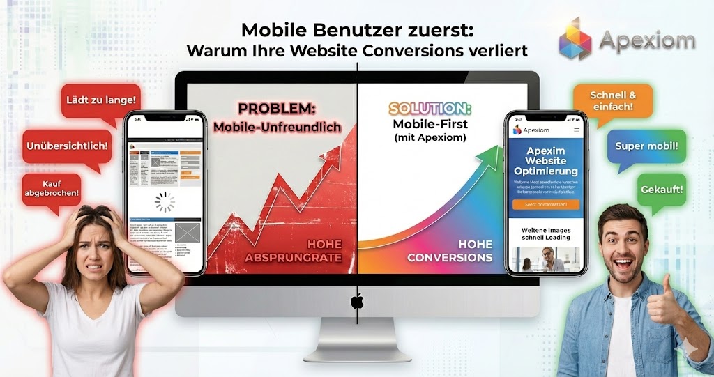 Websites & Conversion
Mobile Users First: Why Your Website Loses Conversions on Mobile?
February 4, 2026
Let’s build your digital future together
From the first idea to measurable success, Apexiom Engineering is your partner for software, AI and sustainable growth. Made in Germany, personal and on equal footing.